Thew new charts in voluum ... do you like them? I don't :( (12)
Thew new charts in voluum ... do you like them? I don't :(
It's been a few days since you guys at @Voluum introduced the new charts, but I still can't get used to it and to be honest, I liked the old ones way better  I kinda preffered the 1 chart instead of 2, it was easier readable than it is now.
How about making this "update" optional, would that be possible?
Wondering if I'm the only one who is not exactly happy about this update, anyone else? 
they are OK, I do like the compare feature.
something that I would love to see is being able to group things better. In
 ))
))

It's shocking, but at the end of the day, it gets the job done for them.
At least the new ones separate the $ metrics, but still not great.

Prosper202's bar charts were still IMO the best way to get a sense of things at a glance.

I wish
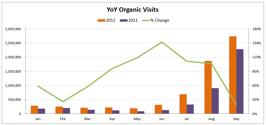
The ideal graph in my opinion would be a combination charts like these, with bars for the $ metrics, but showing net loss days below the x axis, and then lines for visits.

Agreed! I've always been a bigger fan of bar charts.
Especially when it comes to short term volatile AM campaigns and big number swings/amplitudes they represent the data frequencies clearly at a glance.
It always seemed like line charts are a lot more suitable for gauging trends over the long term. Even in the above two screenshots the difference is quite shocking, no?
One problem with bar charts is when you have a whole bunch of metrics you want to keep track of at the same time is that they get quite cramped and you'd likely have to show a shorter time frame (or just fewer metrics).
In that case I wonder if stacked bar charts might do the job? Something like this: https://www.chartjs.org/samples/late...r/stacked.html
I don’t like them either. The old ones were OK, not great, but the new ones are worse for me.
Bar charts would be a nice addition for sure!
Sent from my iPhone using STM Forums
never used charts, either old ones or new ones
Hey guys!
Just to give you a general idea, we decided to divide the charts into 2: one with $ metrics and one with events metrics, because we figured it's better to present them separately. Reading through your feedback, seems like it was a move in the right direction though could have been executed better. So we'll use your suggestions and improve the new charts accordingly.
We're thinking of giving you a selectable option to view all the metrics on one chart that's a combination of bar (for $ metrics) and line (for events metrics) charts. Would that do the job for you? That seems like a quick fix on our side. And also, that's why we don't feel like going back to the old ones, with the new ones the potential's there, they just need to be adjusted to your needs better.
Showing data for a couple (or all) of your campaigns at once is definitely the next major step we need to take. Really appreciate the examples you provided, they will be very helpful!
Thanks
Karolina
Interesting opinions
I would love to hear how do you mostly use these charts guys?
To be honest I personally spend most of the time in the "Hour of day" report, where I can perfectly see what's going on, without need for a chart.
And if something goes wrong (or well) I can dig into that particular hour to find out what happened.
Home > Tracking Campaigns > Voluum